The pie chart is one of the most popular charts used in business analysis. Various information can be clearly presented with a pie chart, especially if the purpose of the chart is to compare a given slice to a whole. In this article, you will read how to insert a pie chart in Excel with a few clicks.
Firstly, select the range of data that contains the information you want to plot in the chart. In the example below, this is sales data for 5 various products:

Secondly, go to Insert tab on the Excel Ribbon and find Insert Pie or Doughnut Chart command in Charts group of commands:

After clicking on it, you can see drop-down list with some options, such as 2-D/3-D pie chart or doughnut chart, but at the same bottom you can also find More Pie Charts option:

By using this option, you can select among wider range of available pie or doughnut charts. Moreover, you can also see preview of selected chart:
Pie chart:

Doughnut chart:

After finding appropriate chart, confirm your choice by clicking OK. Once this is done, selected chart will be inserted in the same Excel Sheet, next to data range:

The chart created in this way is incomplete, however, because there are no descriptions of sales corresponding to each section of the chart. To add missing descriptions, select the chart and go to the Chart Design tab on the Ribbon and select Add Chart Element, then Data Labels:

With this option, you can define in which place the labels describing the sales value will be placed. After hovering the mouse over each variant, it’s appearance is immediately visible on the chart:

Pie chart can be formatted, by using ready chart styles or color sets, or by selecting own settings. Ready styles and color sets can be used, after selecting the chart and clicking on Brush icon located next to the chart:


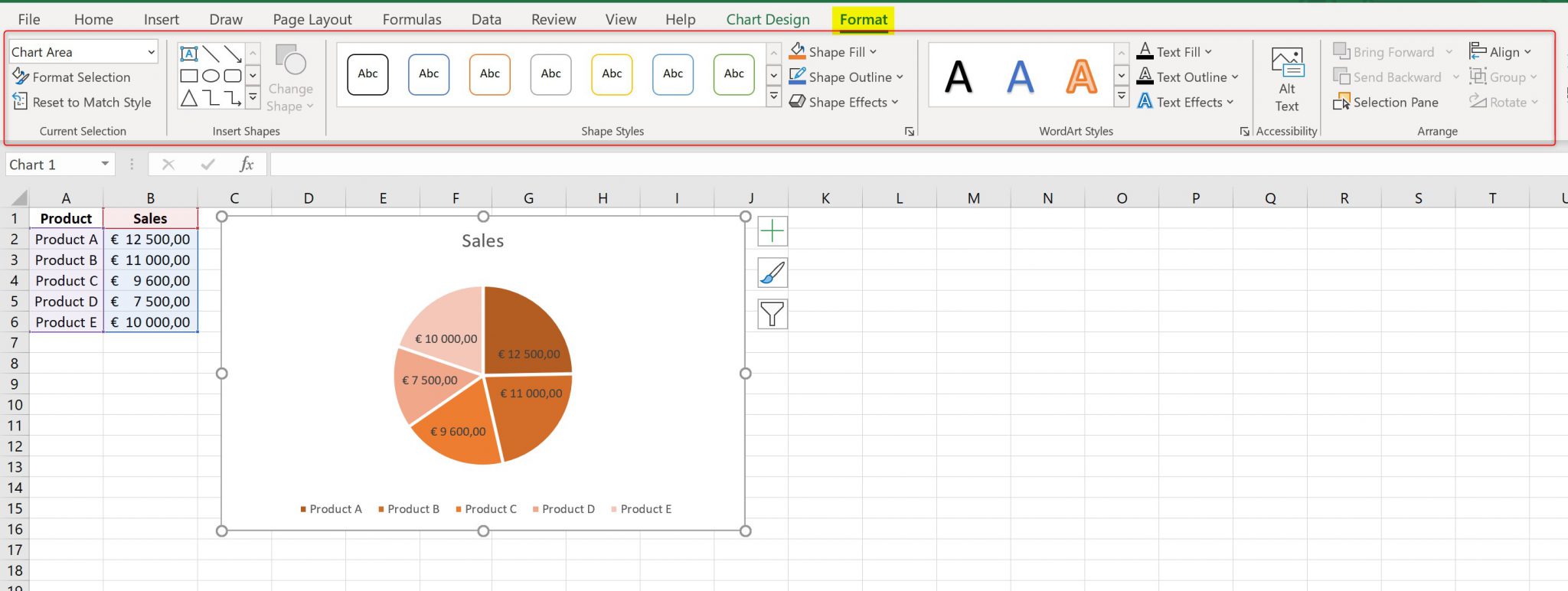
More detailed formatting options, which allow to create your own chart style are located in Format tab on the Ribbon, which is available after selecting the chart:

